
Moodboards
(text not clear) “I want one of the characters in my aniamtion to move in a slightly unnatural manner, similar to what’s shown here.
Much of the art is by Joe Taylor who uses mostly uneven shapes and dynamic poses.
I also like the dark purple lineart they’ve used. It makes the flat colouring more visually striking.
The lines and shapes are slightly less complex but there’s more detailing on the face/fur.
Less focused on the shape but varied colours of the lines have the same effect as above.”
“Cats have a distinct set of shapes but pose in more dynamic ways.
Cats also emote with their tails which can be used to my advantage, since cats can be ‘blank-faced’.
Most animals consist of simple shapes that could be made more unique in some way.
Interesting facial expressions while still remaining ‘cat-like’.
A good piece that shows the different silhouettes cars can have. How can I push beyond these?”
“Going for non-traditional colours (for an animal character).
Softer colours (perhaps for the younger voice).
Stronger colours for the adult’s voice.
More sharp, perhaps obnoxious colours?”
Character Designs
When conceptualising my younger voice’s character, I obviously had an animal in mind – particularly a cat. I thought about what features separates a kitten from an adult cat, rounder face, rounder body and bigger eyes, to name a few. I applied these to my character, adding small quirks like comically large eyes and a rather blank stare to match with the character’s straight-forward answers. The colours I wanted for this character were slightly softer ones in comparison to the older voices.
In contrast to my previous character, I wanted the adult cat to have slightly sharper features (as many adult cats do), with a sleeker body, and longer tail – which I plan to utilise for interesting movement in the final animation. The colours are still soft, however slightly more jarring in comparison to the kitten, especially with his added accessories which are purely just for fun.
Storyboard
My storyboard was essentially to help to lay-out where my keyframes would be and also where the scene changes would be located. I didn’t want to change the angles too much as I knew this would become difficult to handle in the production stage, so I used a facing-up angle for the kitten, and a facing-down angle for the adult cat to look more interesting and also highlight the size difference between the characters.
Background
I wanted to keep my background simple, yet interesting. I chose colours that matched my character’s colour palettes to avoid clashing. There is minimal shading minus the floor in order to make the image look more like a background, and there are some blank spaces – but I left them blank since I knew they wouldn’t be visible!
Mouth-sheet and X-sheets
The mouth shapes and x-sheets were incredibly helpful in mapping out my lip-sync animation. I simply scrubbed through the audio in Adobe After Effects and found out what ‘sound’ would go where for each frame.
Final Animation
Final Reflection
Beginning with pre-production, I had to think about which audio clip would be the best for me to animate. I chose the clip where two voices (an adult and a child) are having a conversation about where the child’s mother ‘found them’. It was a rather comedic audio clip and I thought that animating two different types of characters would help my animation come alive. I wanted to avoid animating humans as this was something that I had done before, and I decided to use cats instead. This is because cats have a rather sleek, unique shape and most times can be less complicated to animate in comparison to humans. Using inspiration from other artists; I found that purple, beige, and peach-toned colours would look the most polished and so I decided that that would look the best for my animation. Another thing that helped during pre-production is looking at basic shapes, and seeing what makes a distinct silhouette; cats consist of triangles and ovals usually, so I made sure that the characters were unique to each other but still resembled a without looking at defining features such as the whiskers.
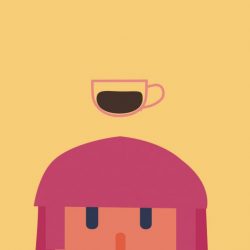
With the image of my characters in my mind, I made a rough storyboard to help me figure out when there would be a scene change or where I would need to sketch out my initial keyframes.I wanted there to ideally be a scene change whenever the older male spoke, and only made a separate shot for the younger male for dramatic or humorous effect (e.g. when he says “from the shop”.). I also needed to create a backdrop for the animation. Although I knew much of it might not be shown in post-production, I still wanted to put some thought into it. I looked at different colour schemes that would match the cats. From the character designs, I knew the background had to be fairly bright; however, not so distracting that it was impossible to focus on whoever was speaking. After making a few backgrounds, I ended up with the final one included in the animation, which was coloured flatly and had the setting of a cafe, as I thought this would fit the characters the most.
The production section of the project went fairly well, since I’ve used Toon Boom a few times. Most of my post-production work was done in Adobe After Effects which is luckily another software that I’m familiar with – though not much tweaking was needed! With that, most of my pre-production was done in either Photoshop or Clip Studio Paint, the latter for painting and the former for making small colour changes with adjustment layers. Overall production went fairly well – I could have been better with time as I ended up working into the holidays when ideally I should have finished within the five-week period given, however this is something for me to keep in mind for next time.
If I could restart this project, or if I had more time, I would consider shading in my characters in order to give them more depth so they don’t feel flat and pasted onto the background. I also wasted a little bit of time by creating a background that didn’t quite go with the characters – so I need to make sure to plan every step so that I make the most of the time given to me to make the film. There were a few challenges during the whole process, however, the biggest one for me personally was trying to do dynamic animations, as this is not quite my strong suit! Initially, I wanted the older character to move around much more but I realised that time and lack of experience would not be in my favour – so exploring different shapes and character movements would benefit me for future projects. Other than the minimal challenges I experienced during the project, I had a blast learning all of the pre-production material (particularly the x-sheets) as it truly helped me get through the animating process smoothly. Another advantage I had was already knowing how to use Toon Boom from previous projects, so working with the features within the programme with prior knowledge saved me a lot of time! Overall this project was useful in learning the core basics of character and lip sync animation, and the payoff was great. For my next project, I will try to experiment and broaden my horizons a bit – working outside of my comfort zone.